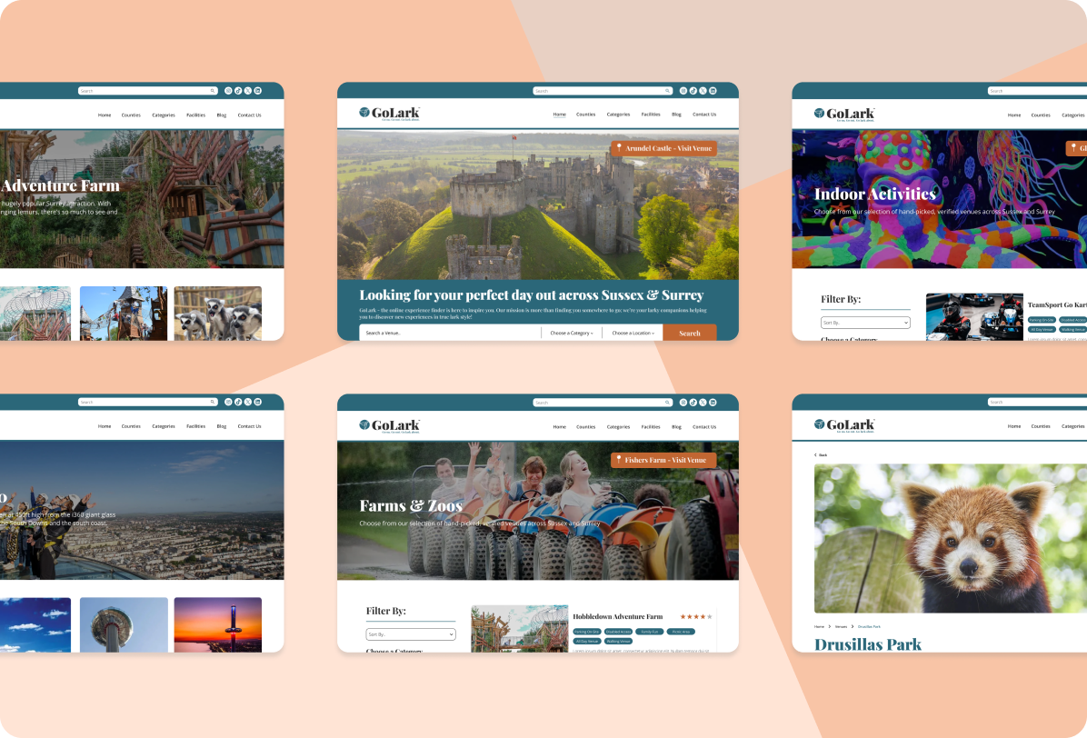
Designing a new venue listing website with intuitive filtering mechanisms, all on a limited budget.

To design a new website that enables users to effortlessly navigate through various venues using multiple filters and categories, thereby enhancing the search experience and facilitating the discovery of the perfect day out.
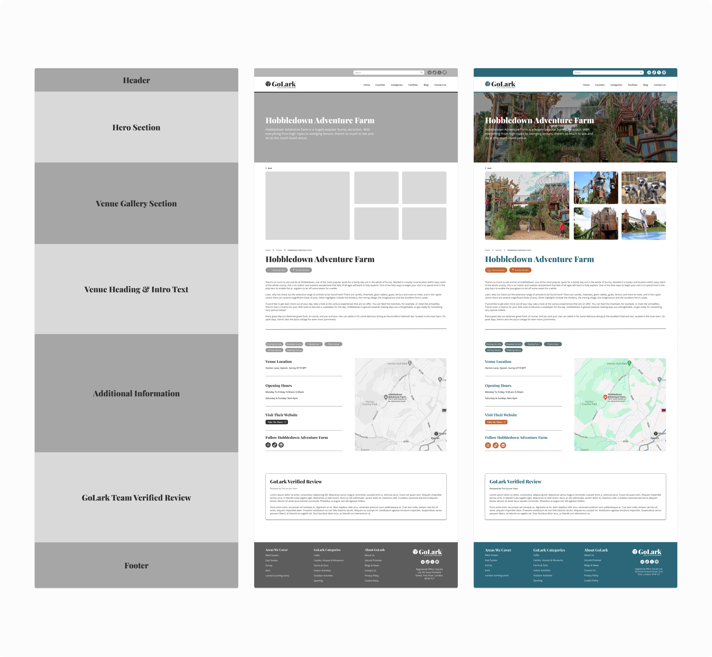
GoLark also required that there would be two levels of listings on their new website, Standard and Premium. The standard listing would be the basic option for venues to appear on the GoLark website at no charge. The premium listing would include an image gallery and some other added benefits at a cost for the venues.
UX/UI Designer
GoLark
UX Research, UX Design, UI Design
In order to gain some insights into what the new GoLark website needs and what it should include I delved into some market research of some of GoLark’s
direct and secondary competitors, I focused my attention on venue listing websites in the same areas as GoLark.
I examined the following websites, Sussex Top Attractions, Day Out With The Kids, Experience West Sussex & Time Out. Through this research, I identified numerous strengths and weaknesses inherent in each website.
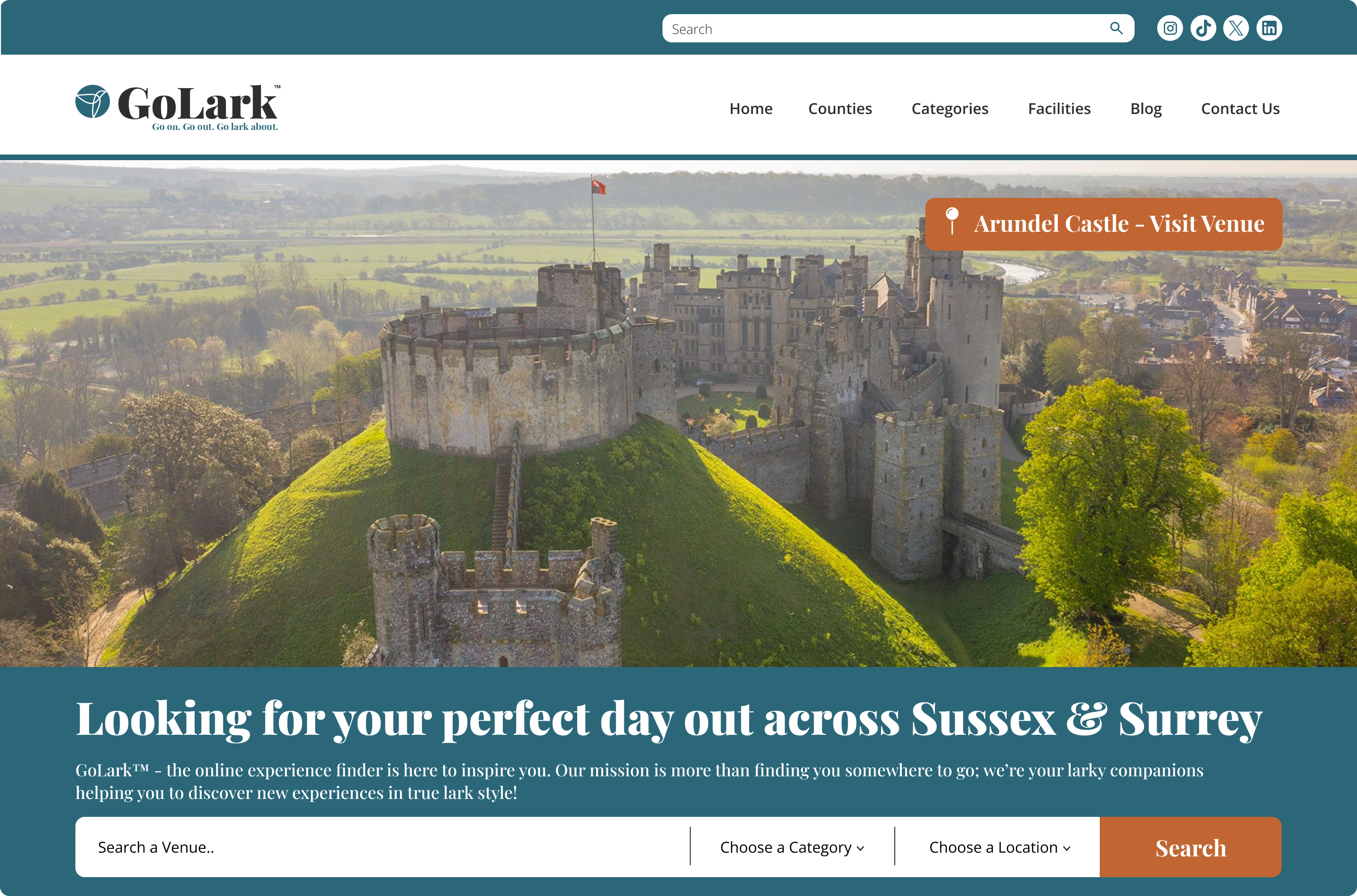
All the top competitors I researched had these same simple traits on their website landing pages:
I then conducted a series of user surveys targeting GoLark’s target audience to identify their needs and preferences for a new venue website. Additionally, I gathered insights into the challenges they encounter with existing venue listing platforms.
In order to generate data and online questionnaire was created and shared across different platforms. The target market for the questionnaire was individuals, couples and families living in Sussex. The questions were focused on venue filtering, reviews, trust and the use of competitor platforms.
The completion of my market & user research and user interviews that I carried out led to the creation of the following two personas: Emily Jenkins a mum of two young children and Jack & Lucy Thompson a couple in their late twenties looking to spend quality time together with their dog at weekends.
Both Emily and The Thompsons are spending a lot of their time searching multiple sites for the right facilities for their different needs, their ideal website has a good filtering system.
They both often find other websites don’t have reviews & some listings are not up to date. This is something that they find frustrating as they like to see reviews of venues as it fills them with more confidence in the suitability of the venues they are visiting.
Emily and The Thompsons like reading up on information about the venues they might visit, and often find some websites don’t contain a lot of details, so their ideal website would have a bit of info about each venue.
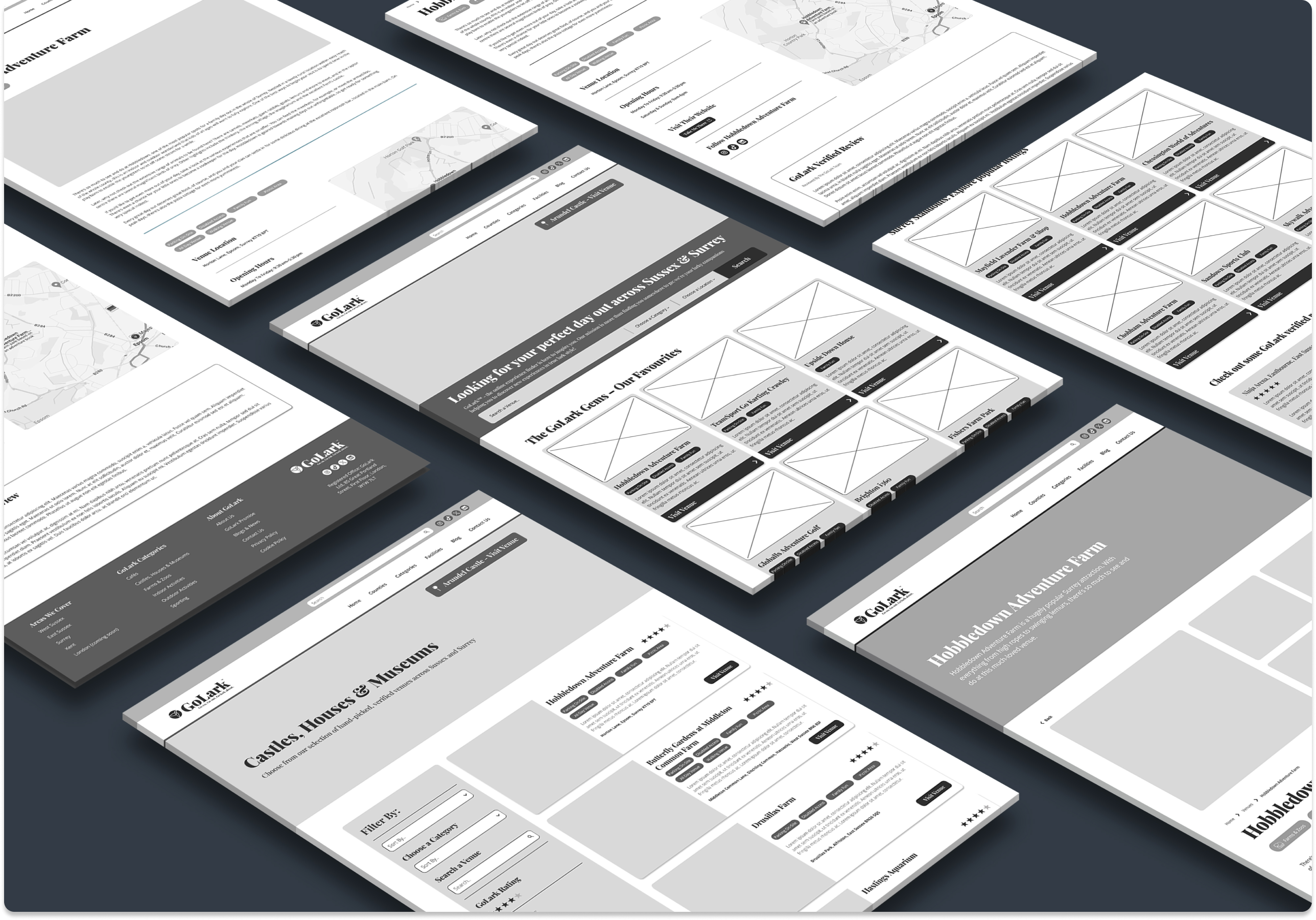
The next stage after conducting my user research, I embarked on the UX Design. The designs were created off the back of the user research, personas and the GoLark sitemap. The designs aim to streamline the user experience, enhancing navigation – including an easy-to-use filter functionality. I sought to address the pain points identified during the research phase and optimise the usability of the final website.
Through prototyping, I transformed initial ideas into interactive mockups in Figma, enabling us to visualise the user journey to filter the different venues and facilities.
This then allowed me to carry out some user tests on the a few participants and the GoLark team. During these tests I gave each volunteer a series of tasks to complete on the site, for example finding a venue through filtering.


The new website allows users to find their perfect day out, through a strong filtering system allowing them to finding their desired facilities at each venue. Whilst incorporating many other usability features like verified reviews.
Designing a website that was targeted at people of all ages and backgrounds, I learned that the website usability had to be really thought out so each page has the best user experience as possible!